September 11, 2016

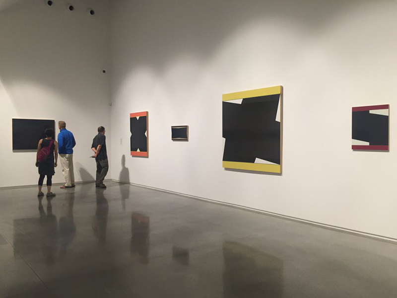
Installation view of "X/V" by Don Voisine. Photo by Owen Kany

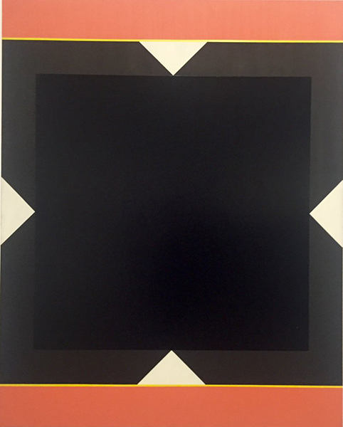
“Ava” by Don Voisine. Courtesy of Center for Maine Contemporary Art

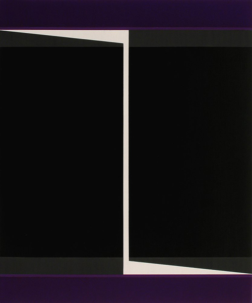
“Divide” by Don Voisine. Courtesy of Center for Maine Contemporary Art
Don Voisine’s ‘X/V’ is cool, calm and perfectly contained
What you see is what you get – in the best way possible – at this Center for Maine Contemporary Art show.
By Daniel Kany
The timing is impeccable for Don Voisine’s “X/V” at the Center for Maine Contemporary Art. Voisine hails from Fort Kent but, since the 1980s, he has made his way in the art world from the vantage of Brooklyn. Voisine’s hard-edge abstractions have their feet in postwar American painting and their eyes on the emerging moments of Modernism. His patience, aesthetic, craftsmanship and ethic have paid off: He is now finding success on both coasts, in the middle and in places outside of America.
“X/V” is a large show in the CMCA’s soaring main gallery that was inaugurated with Jonathan Borofsky’s visually bold and all-encompassing installation of sculptures, paintings, objects and more. While Borofsky’s exciting work was hotly subjective, colorful and borderless, Voisine’s elegantly subdued installation features work that is cool, calm, heady and contained.
Several major forces brought this show into being, among them the creation of CMCA’s space, Voisine’s success, that New York/Maine thing (there is also a blossoming Brooklyn/Maine thing), and the role of abstraction in Maine art. Let’s be clear: To see “X/V” isn’t simply to stand in front of a bunch of reductive, hard-edge, mostly black paintings, it is to encounter all of these things – and more.
For fans of hardcore abstraction, Voisine is about as good as it gets. His work is well-executed, confident and sophisticated. His paintings announce themselves as black-tie formalism. This is an ironic aspect of painting: The appearance of simple is complex to make, while looseness is an instant (and easy) gate to visual complexity. Voisine’s aesthetic follows a reductive path that veers away from anything unnecessary: color, texture, curves, narrative, etc. This means that everything in Voisine’s paintings intentionally appears intentional. Again, the irony: This creates a clear path for following Voisine’s thought process – which makes these more substantially subjective works of art than pretty much any messy expressionism.
Voisine’s “Ava,” for example, features a thick, black, squared “X” above and below bands of salmon orange with an interior trim line of yellow. A closer look reveals a glossy black square in the center of the “X.” This initiates a reconsideration of the “X” so that it can be seen as a charcoal-dark matte ground square with white triangles reaching in symmetrically from the edges. This kind of shift, unlike recognizing imagery, is perceptual; so it toggles back and forth depending on the viewer’s style of scanning the work. To stare at the center is to see something very different from following the edges and forms, just as Voisine intends. However, if you want to see a Stella frame on a Malevich, you will. If you want to see graphic design, you will. If you want optical edge effects, you’ll find them. But it is very unlikely you will see all these things – particularly because you can’t see them simultaneously and the ultimate guide is your own sensibilities. Voisine’s visual intelligence comes in the form of two-dimensional design. This is the vehicle of his strength but also a weakness of the work – depending, once again, on the viewer. If you are looking for a way out, Voisine’s formalism will appear like design, which for some viewers is tantamount to decoration. For us design fans (and fans of post-painterly abstraction in general), it’s the opposite: Design implies a conscious path to the coherent presentation of visual intelligence. Conscious design, for some, implies something contrived – and therefore, fictitious theater – but this notion belongs to the ever-more out-of-fashion abstract expressionist model of art in which authenticity is connected to pre-conscious impulses rather than intentional (i.e., contrived) choices.
Voisine’s paintings are predicated on symmetry and the rectangle. Looking back to the modernist standards, this implies philosophical modernism as much as design assumptions: The human body used to perceive the rectangular paintings is symmetrical. The motion of Voisine’s paintings is to follow the design language of abstract painting to question and test the stability and function of that structure. “Divide,” for example, is also a vertical canvas with a black square in the center (if it’s Malevich worship, I fully support it). But Voisine makes the square hard to see by leading slender white triangles in from the top left gray band above the square and then from the bottom right gray band below it and connecting these with a white Barnet-Newman “zip” down the center of the canvas. In other words, this is an extremely symmetrical work tilted by a small (but high contrast) axial gesture. Oddly, the image spins if you look at the center, but not if you read the white form from tip to tip or its lightning shape. This dynamism, then, is viewer-dependent: The core of Voisine’s work is the balance between the encounter with the work and the perception of it.
The encounter happens in an instant and the perception takes place in time. This is particularly evident in Voisine’s matte-against-glossy passages – which many viewers examine by getting very close and bending down to look up the surface to let the lights reflect off the surface of the painting. At that time, they cannot take in the overall structure of the work – only its material finish. That structure is with them, however, as a memory, since it asserts itself as an intentionally clear and organized design. In turn, the viewer takes the data from the perception and mentally adds them to the encountered structure.
This predictably rhythmic shifting between cognitive and perceptual modes is the mark of Voisine’s success. Conceptually, Voisine seems to be pushing hard for binary logic – the rectangle with its sides as opposed to the X with its corners, spin or still, dark or light, color or not, symmetry or not. Even the title of the show, “X/V,” which in Roman numerals is 10/5, is a hilarious joke about digital logic (we have five “digits” on each hand, which is why humanity uses base 10 math), which reduces to 2/1, or 2… binary logic. But Voisine’s work is not the stuff of nerdy math (think computing), since math requires algorithms. Rather, this approach is about system as opposed to math. This is the stuff of nature’s symmetry, such as why we have two hands and two eyes, as well as spirals and fractals – stuff we know visually rather than theoretically. It is through this route that we can understand why abstract artists with the propensity for symmetry – Malevich, Mondrian, Rothko, Newman, Reinhardt and so many others – had a spiritual link (mystical, really) to nature. Enlightenment science, after all, gets so caught up in the “how” (algorithm) that it often forgets to ask the “why” (meaning).
“X/V” doesn’t yet prove the CMCA’s soaring space can handle painting well, since the geometrical sense of Voisine’s paintings uses the same language as the building. And the two long tables with smaller works, books and prints may even mislead viewers about the structuralist logic of his paintings – they are not floorplans, after all. (What to do with all that floor space? I would have liked to see it open.) But it is a tremendous exhibition. It is time for us to lose the assumption that abstract painting in Maine is secondary stuff. And it was time for us to see Voisine’s work in a Maine space worthy of its design intelligence.
