May 12, 2019
Excavating the Radical Roots of Abstract Painting
With each new exhibition, it becomes more apparent that Don Voisine is adding his own earned options to the legacy of geometric abstraction.
In 1992, Don Voisine began working with a centered black form surrounded by a border. In 1999, when he introduced the diagonal into his compositions, spatiality became another component in his work. Electing to stay within a circumscribed vocabulary of hard-edged geometric forms — rectangles, triangles, parallelograms, and trapezoids — he opened himself up to the possibilities suggested by contrasting proportions and color changes along the panel’s borders.
At some point, I cannot pinpoint the date, the centered black form became blue or red. In addition, it split into two planes, with one overlaid by the other. Voisine differentiated the planes by making one opaque and dense (like a veil of charcoal) and the other translucent (like a sheet of smooth, colored glass), against a white ground. Each color he uses in the border also has its own material identity.
With each new exhibition it becomes more apparent that Voisine is adding his own earned options to the legacy of geometric abstraction, as established by Piet Mondrian and Kasimir Malevich, and further extended by Ad Reinhardt, Barnet Newman, and others. This is no small accomplishment, as it attests to the possibility of artistic growth through something other than capitalist markers of progress (i.e, personal branding, marketing, or entrepreneurship, or the use of new materials and up-to-date processes).
While some critics and curators might consider what Voisine does as old-fashioned, I see its refusal to celebrate entrepreneurship’s penchant for displaying its capacity for excess as a commitment to the radical roots of abstract painting. It is why I went to his exhibition, Don Voisine, at McKenzie Fine Art on the Lower East Side the morning after it opened.
There are 17 paintings in the exhibition, with the largest measuring 40 by 60 inches, and the majority ranging between 12 by 12 inches and 30 by 24 inches. I have started to think of Voisine’s use of modestly scaled paintings as a critique of an earlier generation’s reliance on large formats, which, by the time Frank Stella and Helen Frankenthaler were well into their careers, became a little too in sync with the rise of McMansions. What was once regarded as heroic and innovative began to seem like another form of bragging. Voisine’s interest in close looking and minute differences amounted to an ethical rejection of signs of wealth and good taste: he made work for apartments rather than manors.
The latest incremental changes that Voisine has made to his work involve his use of saturated color, particularly bright yellows and luminous blues, and the staging of his forms. By this I mean that the borders feel, at times, like curtains, which have been pulled back to reveal abstract forms interacting on a stage. A element of theatricality has entered into the work.
Also, it seems to me that the interaction between the centered form and the border that became a focal point of his earlier work, has spread throughout the painting. There are different pressure points, seams, overlays, shifts in colors, and surfaces, working in tightly calibrated, frictional harmony.
This, I think, is Voisine’s contribution to geometric abstraction: the range of differences he launches within a painting ideally prompts the viewer to slow down and become attuned to difference. This kind of ruminative looking is the opposite of the narcissistic experience of selfies and shiny, reflective surfaces. Rather than continuing the trope of all-over uniformity, Voisine emphasizes the differentiated states of materiality embodied by the five distinct “zips” that Barnett Newman used to section off the surface of “Vir Heroicus Sublimis” (1950–51), which is in the collection of the Museum of Modern Art, New York.
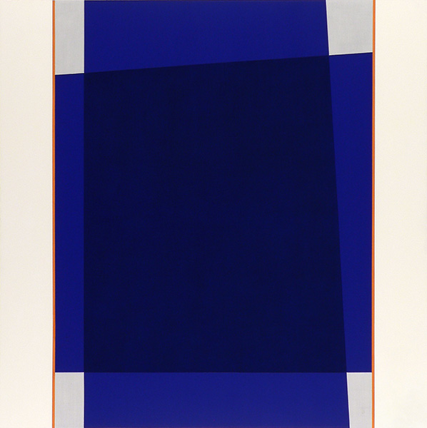
In “Orange Zip” (2019), which was done in acrylic and oil on a square panel measuring 40 by 40 inches, Voisine overlays two blue trapezoids within a bounded space framed by a creamy white bands. An orange “zip” is wedged between each of the flanking white bands and the centered, overlaid trapezoids. At the same time, four scumbled gray spaces demarcated by the layered blue planes and the rigid vertical “zips” draw our attention to the corners of the interior, bordered rectangle. Finally, the central, semi-transparent blue planes form a darker blue trapezoid across the space where they press against each other.
Does this dark blue trapezoid gesture to a world beyond, a sublime? Is it a portal or paint-as-paint or both? Like sentinels standing at attention, the ‘zips” in contrast sharply with what lies on either side of them — the creamy white bands and the layered spatiality of the overlapping blue trapezoids. So many different tensions have been put into play. The “zips literally separate one domain from another. The flanking bands function architectonically as well as theatrically, curtains pulled back to reveal the stage.
The possibility of reading the centered forms as on a stage adds a self-reflective element to our engagement with the painting: we see ourselves seeing the forms — their interaction with each other and with the space they occupy — evoking both dance and sculpture, particularly that of Ronald Bladen and Tony Smith.
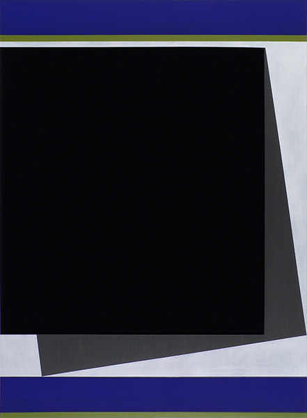
In the blue, green, gray, and black ”Spencertown” (2018–19) — the title alludes to the place where Ellsworth Kelly lived and worked for many years, until his death in 2015 — a gray square seems to have slipped out from behind a black one, which is pressed against the painting’s left edge, just below the upper border of blue and green. Is the gray square, whose lower right corner touches the panel’s right edge and whose lower left touches the bottom blue band propping up the black square, or is it the black shape holding up the gray one? This dual reading is reinforced by the bands running along the top and bottom edges, both of them composed of a wide blue band on top and a thin green stripe below. Are we to understand this pairing as sky and earth or simply as color against color?
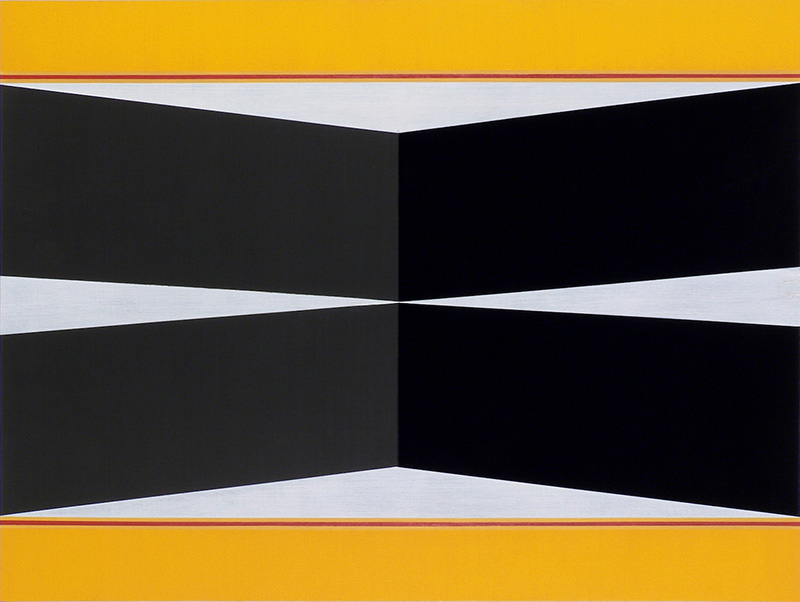
In the horizontal painting, “Warning” (2019), which measures 18 by 24 inches, the horizontal yellow borders at the top and bottom, punctuated by a red “zip” are apt to recall the barriers seen at one of the many New York construction sites, while the wide gray and black diagonal bands that meet at the panel’s midpoint without overlapping evoke the asphalt of the streets.
The urban aspect of Voisine’s paintings underscores his alertness to everyday sights and how they might inspire the forms that he places into his paintings. By distinguishing each color with its own material identity, he counters the tendency to assume that all visual art is destined to become a digital image inhabiting a purgatorial field.
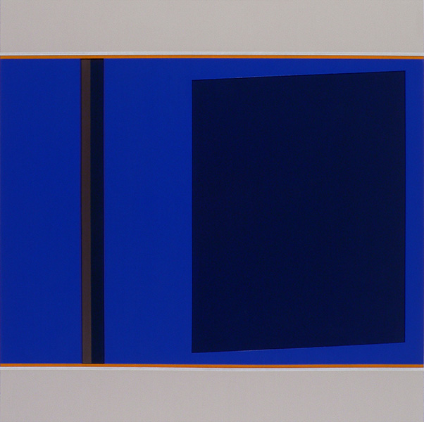
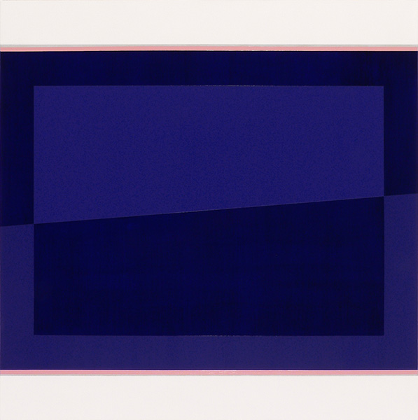
In his use of saturated blues, as in the square painting, “Outside” (2019), in which cobalt blue and indigo planes overlap/interlock with each other and with the alternating shades of an architectonic blue frame, wedged between two white bands and two pink ‘zips” running along the top and bottom, Voisine is pushing color further into a new territory for himself and for geometric abstraction.
As ably proven by the Oulipian French writer, Georges Perec, who wrote a 300 page novel without using the letter “e” (La disparition, 1969) and by Voisine, working within his circumscribed geometric vocabulary, severe constraints and expressive freedom can go hand-in-hand. More importantly, something unexpected, delightful, funny, or quirky can unfold. These self-imposed restraints are not purely formal, nor should they be read that way.

