Ding by Aaron Parazette:
The word is lost in transfiguration.
Gregory Lind Gallery
What's seen confuses what's read
Kenneth Baker
Saturday, September 4, 2004
Probably everyone on occasion has written down a familiar word and for no reason suddenly found that its spelling looks wrong or odd. Houston resident Aaron Parazette's paintings at Gregory Lind provoke something like that experience.
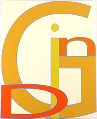
Parazette paints words. "Ding" (2004), in a manner typical of every picture here, fills a canvas with its title's four letters.
"D" comes first, but only in that it sits at the lower left corner, sharing its vertical edge with that of the painted surface, though it also overlaps "i" and "G."
But Parazette has so mismatched the letters' sizes and cases, here squared them up with each other and there magnified them to suit the canvas' dimensions, that one sees letters and words before reading them.
We might call "Ding" a representational picture, not so much because it offers the image of a word but because, like an image, it puts something in the viewer's mind: a certain sound, the idea of a dent or other minor damage, especially to a car.
Once stimulated, the mind finds other words hiding in plain sight: "gin," "in," "I."
In "Insane" (2004) the letters, stacked out of order, stand upright on all four of the picture's margins. Their disparities trick the eye into misreadings, such as "asinine" and "inane."
By setting up an ongoing tension between looking and reading -- and implicitly between seeing and interpretation -- Parazette makes a viewer aware of what are normally unconscious transits of eye and mind.
Typographers played an important part in early modernist tendencies such as Futurism, Dada and the Bauhaus. Parazette's work awakens those references, but it probably recalls hard-edge abstraction more readily. Frank Stella's late '60s paintings come to mind, as do those of some older contemporaries, such as Paul Feeley and Jo Baer.
Up close, Parazette's paintings show their fine bones: meticulous multicolored borders that bound all his forms, giving them an optical buzz.
More than smart-alecky conceptualism, Parazette's word paintings have an internal elegance that will probably give them unexpected staying power.
Sharon Engelstein's ceramic sculptures have more physical heft but less artistic substance than Parazette's paintings. She makes creepy tabletop pieces that look now creaturely, now mineral, now abstract.
"Diptip" (2004), for example, looks like a large smooth stone with a red- tipped tongue that can make one think of the Rolling Stones' logo.
Engelstein has shaped her pieces oddly enough to make one feel that they might change shape indiscernibly behind one's back, but even that does not quite give life to their post-Pop surrealism.