May 19, 2013
Geometry Under Pressure: Don Voisine's Paintings
by John Yau on May 19, 2013

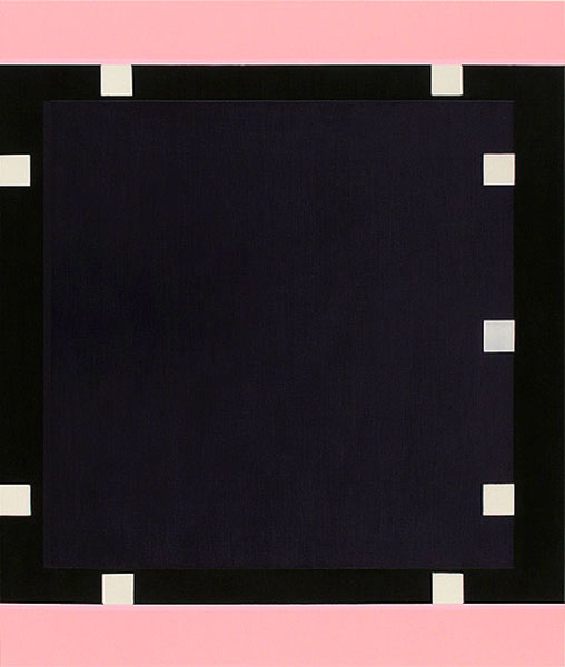
Dan Voisine, 'Peg' (2013), oil on wood panel,
26 x 22 inches (all images courtesy McKenzie Fine Art)

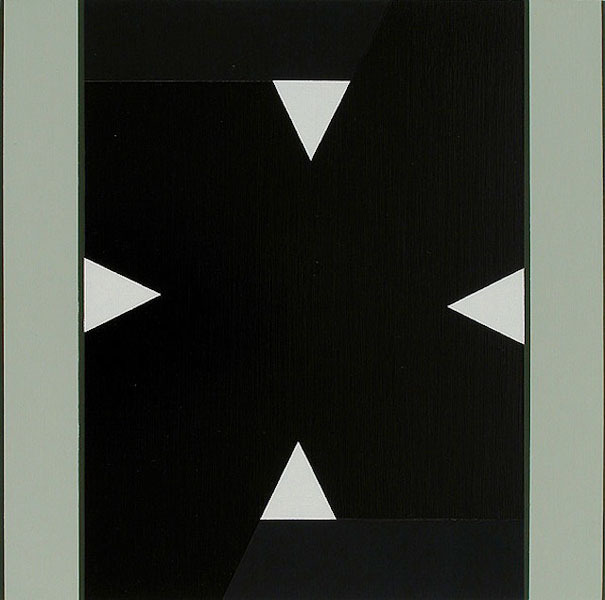
Don Voisine, 'Dub Step' (2013), oil and flasche on wood panel,
11.75 x 11.75 inches

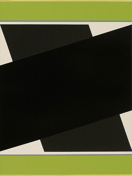
Don Voisine, 'Rickshaw' (2013), oil on wood panel, 16 x 12 inches
Don Voisine's oil paintings on wood brim with all kinds of tensions: between flatness and spatiality; stasis and torque; containment and expansion; light and dark; tonal gradations and sharp contrasts; matte and glossy surfaces; transparency and solidity. Once you begin noticing the variety of stresses animating these paintings, more start to emerge - that's how finely and tightly tuned they are. Voisine seems to view painting as a contested object, a place where conflict and dialogue overlap out of necessity and urgency, with neither superseding the other. His works invite scrutiny, requiring the constant refocusing of attention. Despite their deployment of a central form comprised of two black shapes, one overlaying the other, the paintings defy the simplicity we associate with minimalism and Frank Stella's oft-cited credo: what you see is what you see. They are paintings made to disassembled and reassembled in the mind's eye.
In an interview with Brent Hallard about his exhibition at Gregory Lind Gallery, San Francisco, CA (November 4-December 23, 2009), Voisine made this observation about his use of black: I became very interested in black paintings, early Stella, Kelly, McLaughlin, that magnificent gigantic black Clyfford Still at the Art Institute of Chicago, and of course Reinhardt. They seemed to be among the most difficult, challenging and least seductive paintings around. I had to give it a shot.
From 1992 to 1999, Voisine painted a centered black form surrounded by a border. Often the black form was notched, interrupted by white spaces. The figure (or black form) was either a flat plane or a thing in space. The fact that it could be read as one or the other introduced another level of sentient tension into the work. Since 1999, when he introduced the diagonal into his work, Voisine - who has absorbed aspects of Piet Mondrian and Kazimir Malevich - has been expanding an idiom that is all his own. In that sense, he has extended beyond what many theoreticians assert are culminations - or end points - in the history of painting, entering into a territory that exists outside language, particularly the narrative that concludes with the death of painting. Voisine's quietly insolent stance points to one of painting's particular strengths - it can resist being domesticated by language.
2.
In his third exhibition at McKenzie (May 3-June 19, 2013), Voisine pushes the tension to another level, underscoring the ongoing conflict between expansion and containment. In the small, square "Dub Step" (2013), the lower left and upper right arm of a black X extends past the wide black border running along the top and bottom of the painting. At the same time, the X is contained on each side by a pale, olive green band, which is joined by a dark green strip of a different width running along each edge.
In "Dub Step" and other paintings in the exhibition I kept putting the black planes together and taking them apart. The X is both a form and a gesture (X marks the spot). The diagonal thrust of its upper right and lower left arms conveys the deeply human desire to reach beyond the borders containing it.
In the formal tensions Voisine establishes in his painting - as the result of a process, his elements never appear forced or extraneous - all kinds of feelings and possible readings come into play. This is one of the deep, abiding strengths of the artist's best paintings; they become analogical. In the late 1950s, Stella squeezed space and meaning out of painting. Fifty years later, Voisine has found ways to squeeze both space and meaning back in, to open up what has been pronounced closed. Voisine wasn't the only one to recover painting, but, unlike many others who rejected the narrative of painting's death, he did it with a reductive vocabulary of hard-edged geometric forms.
3.
Voisine works on squares and rectangles, both vertical and horizontal formats, with some horizontal formats extended to become synonymous with panoramic views. He seems open to trying any proportion and color. In this exhibition, I found myself associating his palette with office storage units (yellow-beige and olive green), gothic literature (violet and scarlet), young girls' birthday celebrations (red and pink) and nature (deep blue). His whites are never blank offsets for his blacks but colors in themselves, ranging from cool to warm.
When he overlays one black plane (usually glossy and semi-transparent) over a visceral black plane resembling a veil of charcoal, Voisine defines a form which viewers are provoked to undo. Such an overlay - in which each plane is distinct in its color, texture and relationship to light - seems to me one of the most imaginative reconfigurings of Reinhardt's juxtapositions of different blacks to date. Our attention shifts between unity and separation without ever coming to a final conclusion, leaving the painting open to further speculation. Reinhardt may have done the "last painting," but Voisine has done the one that comes after. In doing so, he is claiming some measure of equality with his predecessor - a heretical state that hierarchical thinkers can never accept, much less understand.
4.
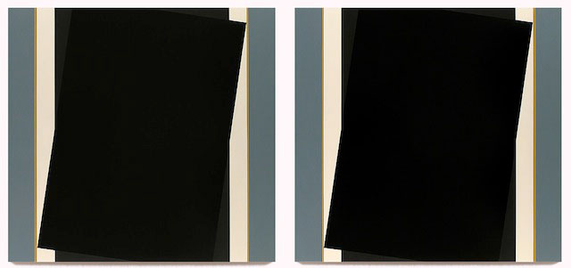
Asymmetry and optical shifts play an increasingly larger role in the work Voisine has put up in his current exhibition at McKenzie Fine Art. In the diptych, "Tip" (2013), he abuts two squarish rectangles to make something nearly twice as long as it is tall. In the painting, which has wide red bands running along the top and bottom edges, two tilting rectangles are overlaid across black, abutted rectangles, whose edges parallel the painting's physical dimensions.
Unlike Malevich's diagonal rectangles and parallelograms, which soar up, Voisine's rectangles tend to tilt down, as if sliding out of whatever secure position they might have once had. There is something funny and sad about the way these tilted rectangles, their corners pushed against the painting's physical edges or a constraining band of paint, have come to rest.
An elegiac current runs through some of Voisine's paintings, but that certainly is not all they are about. His black X - which he keeps changing, from work to work "brings to mind Ronald Bladen's monumental 'X' (1967) spanning the atrium of the Corcoran Museum. Voisine's paintings may be relatively small in scale, certainly in comparison to their minimalist precedents, but the expansive forms feel monumental. It seems to me that the Corcoran would be the ideal place for his first museum survey. It is certainly about time that such attention is paid to this calm pioneer.

Don Voisine, 'Till' (2013), oil on wood panel, diptych, 44 x 46 inches each panel