artpractical.com
February 2011

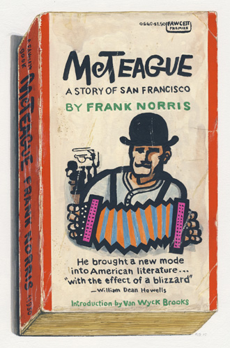
Richard Baker. McTeague, 2010; gouache on paper; 12 x 10.5 in.
Courtesy of Gregory Lind Gallery, San Francisco.
Richard Baker
by Christopher Reiger
A book's appearance provides clues about its life. That dark spot on the back cover might attest to its one-time involvement in the dispatching of a fleeing silverfish; those shabby bottom corners could be the result of its riding in the back pocket of too-tight jeans. We're told that it's not fair to judge a book by its cover, but, judge or not, a cover has a lot to tell us. So, too, do Richard Baker's gouache paintings of vintage paperbacks. Baker honors his subjects with a regard usually reserved for portraiture, sensitively rendering books by Gertrude Stein, John Steinbeck, Jack Kerouac, Henry Miller, Tom Wolfe, and other celebrated authors.
Each of Baker's books is presented on a plain white background, isolated from its everyday context so that viewers must give it special consideration. One notices the growing tear on the bottom spine of Steinbeck's Tortilla Flats and the yellow-brown staining at the edges of Stein's Lectures in America; these marks of character and history are akin to the age spots and creases that decorate one's skin. Baker's is the keen eye of the scientist, meticulously observing and recording every distinguishing detail. Yet he also looks with the adoring eye of the worshiper. The books that Baker depicts are at once specimens for study and also icons for veneration; this dichotomy is an analogue of the double life of all books. A book's content appeals to the mind, while a book's physicality the smell, the heft of a hardcover, the dry scratch of a worn paperback's pages satisfies our more sensual wants. For the bibliophile, books are coveted objects, treasured no less than enshrined talismans or, not insignificantly, artworks, and Baker's project cleverly elucidates these complex relationships.
The paintings are also sidelong tributes to design. The salary men responsible for the smart book covers featured in Baker's pictures are forgotten. Too bad; the simple a that dominates the front of Andy Warhol's a, A Novel and the striking color, font, and line combinations employed for Frank Norris's McTeague or Miller's The Air-Conditioned Nightmare speak to the care and creative flourish brought to so much twentieth-century book design. The mostly anonymous individuals responsible for this work may be of secondary interest to Baker, but his gouaches are paeans to their handiwork, too.
Baker shares the gallery walls with Tom Burckhardt, another artist who uses book covers in his paintings. Whereas Baker celebrates books as they are, Burckhardt repurposes hardback book covers to create striking abstract diptychs.