artpractical.com
June 16, 2010
You Would If You Loved Me

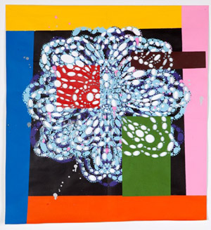
Pinko Salad, 2010; acrylic on cut paper, 29 x 27 in. Courtesy of the Artist and Gregory Lind Gallery, San Francisco.
“You Would If You Loved Me,” Reed Anderson’s solo show at Gregory Lind Gallery, is composed of works on paper and panel developed through a repetitive process of cutting, folding, and painting. Anderson’s color choices are direct but specific, favoring primary and secondary hues, a few pastels, and black and white. The patterns that emerge from the cut absences and the pieces’ painted additions explore symmetry and visual rhyme through graphic and texture.
Many of the works feature loose images of flowers made from clusters of cut holes, circles, and ellipses ranging in size from a little larger than a tack-hole to the size of a silver dollar, delineating exaggerated flower petals. The largest of these floral pieces, at 84 by 90 inches, is Nuppet Tree (2009‑2010), a shimmering, fizzing network of abstractions resembling cabbage roses and lotus blossoms, overlapping and connected by geometric multicolored bars of paint. Often, the paint seems to have been stenciled directly through holes cut elsewhere in the piece, and some areas’ surfaces suggest stamped or dabbed acrylic. A few of the flowers are formed by the negative space of the cutouts, which reveal the gallery wall, colored by paint applied to the back of the piece. The paper itself bears creases, ostensibly from being folded to enable the printing process, and is constructed out of several smaller pieces joined together. A rhythm of working, cutting and painting, subtracting and adding, folding and building emerges. This image of the artist in his studio is elaborated upon by errant finger smudges, the trace of a footprint on the painting’s top edge, and a tiny graphite love note left in place.
Pinko Salad (2010) and Lemon of Pink (2010) also center on basic floral shapes. Both also seem to have been used as their own stencil, with cut-out holes and the painted marks that match them radiating from a central fold line. Painting through the holes creates a false impression of symmetry, as each painted dot or ellipse is matched to a hole on the other side of the paper; but in reality it’s a visual rhyme, a matched set of opposites, an addition produced from each subtraction. Anderson draws attention to this dizzying effect by blocking out squares of flat color over the top of the floral design, highlighting the cutouts, quieting the buzz of the layered colors.

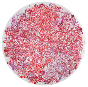
You Would If You Loved Me, 2010; acrylic and collage on cut paper, 94 in. diameter. Courtesy of the Artist and Gregory Lind Gallery, San Francisco.
You Would If You Loved Me (2010) is a lacy circular paper piece, 94 inches in diameter, that includes the same floral motif. It is at once covered with layers of red, pink, orange, and maroon paint, and substantially absent, most of the paper having been fastidiously removed, circle by circle or square by square. Anderson creates an even tension over the whole surface, with no central focal point but rather a floating sense of interest, allowing one's eye to graze continually as the red color visually advances and the cutouts reveal shadows cast by the paper on the gallery wall.
The imagery in One For Joseph (2010) and One For Tony (2010) is complicated, rather than formed, by the cutout and stencil marks. These pieces begin with found magazine images of boats that have been painted around and graphically isolated. The patterns of repetitive cut circles and paint, either blue on white or white on blue, add an almost psychedelic visual noise to the image, referencing bubbles and foam. Though Anderson’s patterns are a strong interfering graphic, ultimately both pieces maintain the visual legibility of the original boat images.
One of the few pieces in the show with no pictorial imagery is Pleasures Of Travel (2010), which is made of spray paint on cut travel poster. In this case, Anderson’s abstractions overlay the large, regular Ben Day dots of mass printed media, highlighting the hand-cut and idiosyncratic quality of his working methods.
The works in this show demonstrate Anderson’s ambivalent consideration of image; the floral imagery is impressionistic, made from broken lines and negative spaces, and the found images are subverted, peeking out around the fastidious handwork and deceptively concise color palette. Anderson’s unequivocal commitment to a studio practice as well as his ongoing investigation of the flexibility and malleability of color and paper ultimately emerge as both the driving motivation for—and end result of—the work. The man-hours poured into his style of mark-making attest to that.